
What Are the Best Colors for Biophilic Living Room Design in 2026?
The best colors for biophilic living room design in 2026 are nature-inspired hues that create psychological comfort and visual harmony with natural elements. Earth tones like sage green, warm terracotta, soft taupe, and deep forest green dominate biophilic interiors because they directly mirror outdoor environments and trigger the brain’s relaxation response. These colors work synergistically with natural materials—wood, stone, and plants—to establish a cohesive connection to nature within your home. Research from the American Psychological Association shows that nature-inspired color palettes reduce stress levels by up to 37 percent when combined with natural materials and elements. In May 2026, interior designers increasingly recommend layering multiple nature-based colors rather than relying on single accent hues. The key principle behind biophilic color selection is mimicry: your living room should feel like an extension of natural landscapes, not a departure from them. This approach supports both aesthetic appeal and evidence-based wellness benefits that homeowners actively seek as they invest in sustainable, health-conscious living spaces.
How Do You Choose the Right Nature-Inspired Color Palette?
Selecting the right nature-inspired color palette requires understanding color psychology and how specific hues interact with biophilic design principles. The most effective approach in 2026 involves starting with a dominant base color—typically a soft, muted green or warm neutral—then layering secondary and accent colors that appear naturally together in outdoor environments.

Dominant Base Colors
Sage green remains the most popular dominant color for biophilic living rooms because it bridges the gap between cool and warm tones while evoking peaceful forest environments. This soft, desaturated green works on walls, large furniture pieces, or as a primary paint color. Warm taupe and greige (grey-beige blend) serve as excellent neutral alternatives that provide sophisticated backdrops for natural wood furniture and greenery. Soft cream and warm white options create airy spaces that amplify natural light and make rooms feel larger while maintaining biophilic principles. According to Pantone’s 2026 Color Trends Report, muted earth tones have surpassed bold accent colors as the preferred choice for wellness-focused interiors.
Secondary and Accent Colors
Layer your dominant color with secondary hues found in nature: warm terracotta, soft ochre, dusty mauve, and deep forest green. These colors should appear in smaller quantities through accent walls, artwork, textiles, or decorative pieces. Terracotta adds warmth and energy without overwhelming the space, while forest green creates depth and visual interest. Avoid highly saturated or artificial-looking colors—the goal is to replicate nature’s naturally muted, complex color relationships. Consider how these colors appear in natural settings: sunset-inspired terracottas, moss-inspired greens, and stone-inspired grays should all feel authentic rather than trendy.
Why Do Nature-Inspired Colors Improve Wellness in Living Spaces?
Biophilic color theory is rooted in evolutionary psychology: humans spent millions of years in natural environments, and our brains are hardwired to respond positively to nature-inspired visual stimuli. When you surround yourself with colors that mimic natural landscapes, your nervous system recognizes these signals and triggers relaxation responses, reducing cortisol and promoting mental clarity.
Psychological Impact of Green Hues
Green is the most psychologically restorative color because it’s the dominant hue in healthy natural environments. Research from the University of British Columbia demonstrates that exposure to green colors activates the parasympathetic nervous system—your body’s natural relaxation mechanism. In your living room, green-based color schemes encourage deeper breathing, lower heart rates, and improved focus. The specific shade matters significantly: muted, desaturated greens (like sage) are more calming than bright, saturated greens, which can feel artificial. Pairing green with natural wood tones amplifies this effect because the combination replicates forest floor environments where humans feel inherently safe and grounded.
Grounding Effects of Earth Tones
Warm earth tones—terracotta, ochre, warm brown, and taupe—create grounding sensations associated with soil, stone, and natural stability. These colors activate different neural pathways than cool greens; they promote feelings of security, warmth, and connection to physical place. In biophilic living rooms, earth tones work best as secondary colors or accent walls, providing visual variety while maintaining the calming foundation that green establishes. The combination of cool greens and warm earth tones creates balanced, dynamic spaces that feel both restful and energizing.
What Common Color Mistakes Should You Avoid in Biophilic Design?
Many homeowners unknowingly undermine their biophilic living room design by making predictable color errors that disconnect the space from natural principles. Understanding these mistakes helps you create authentically nature-inspired interiors that deliver genuine wellness benefits.
Over-Saturation and Artificial Hues
The most common mistake is selecting overly bright or saturated colors that don’t exist in nature. Neon greens, electric blues, and highly pigmented accent colors contradict biophilic principles because they feel artificial and stimulating rather than calming. While these colors might seem nature-inspired in theory, they trigger different psychological responses than muted, natural hues. In 2026, the trend has definitively shifted away from bold accent walls toward subtle, sophisticated color layering. If you’re tempted by a vibrant color, ask yourself: does this exact shade appear in healthy natural environments? If not, it likely won’t support your biophilic goals.
Insufficient Color Layering
Another critical mistake is relying on a single color throughout the entire room. Authentic natural environments contain complex, layered color relationships—forest floors combine greens, browns, grays, and ochres simultaneously. Your living room should reflect this complexity through thoughtful color distribution. Paint one wall sage green, incorporate terracotta through textiles, add warm wood furniture, and introduce accent pieces in complementary earth tones. This layered approach creates visual depth and maintains biophilic authenticity. Rooms with single-color schemes feel flat and disconnected from nature, even if that single color is theoretically nature-inspired.
Ignoring Lighting Conditions
Color appearance changes dramatically depending on natural and artificial lighting in your space. A sage green that appears perfect under north-facing natural light might look cool and uninviting under warm artificial lighting, or vice versa. Before committing to any color, test paint samples in your actual living room under different lighting conditions throughout the day. This prevents costly mistakes and ensures your chosen palette maintains its biophilic appeal in all lighting scenarios.
How Do You Implement a Biophilic Color Scheme in Your Living Room?
Creating a cohesive biophilic color scheme requires strategic planning and intentional implementation across walls, furniture, textiles, and accessories. This systematic approach ensures every element reinforces your nature-inspired vision while maintaining visual harmony and functional comfort in your living space.
Step 1: Select Your Dominant Wall Color
Begin by choosing your dominant base color for wall treatment. For most biophilic living rooms, this means selecting a soft, muted green or warm neutral. Paint the largest wall or all walls in this color to establish the foundational biophilic atmosphere. Sage green, soft moss, warm taupe, and creamy greige are excellent 2026 choices. Apply paint samples to multiple walls and observe them throughout different times of day before making your final decision. This foundational color should feel calming and timeless rather than trendy—you want a palette that supports wellness for years, not one that feels dated within seasons.
Step 2: Incorporate Natural Wood Furniture
Select wood furniture pieces that complement your wall color while introducing warm, organic tones. Light oak, warm walnut, and natural teak wood work beautifully with sage green and taupe walls. Wood furniture automatically introduces secondary color layers—warm browns, honey tones, and grain variations—that enrich your biophilic palette without requiring additional paint or major changes. Current luxury wood furniture market trends for 2030 emphasize sustainable sourcing and natural finishes, which align perfectly with biophilic design principles. Choose furniture with visible wood grain and natural imperfections rather than highly processed, uniform pieces.
Step 3: Layer with Textiles and Soft Furnishings
Introduce secondary and accent colors through textiles: throw pillows, area rugs, curtains, and blankets. Select fabrics in terracotta, warm ochre, soft mauve, and deeper forest green. These textile colors should appear in smaller quantities than your dominant wall color, creating visual interest without overwhelming the space. Natural fiber textiles—linen, cotton, wool, and jute—enhance the biophilic effect because they introduce authentic texture alongside color. Layering multiple textile colors creates the complex, natural color relationships found in outdoor environments. A sage green wall might be complemented by terracotta throw pillows, a warm taupe area rug, and forest green curtains—each element reinforcing the nature-inspired vision.
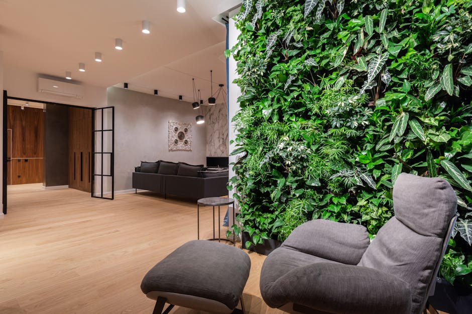
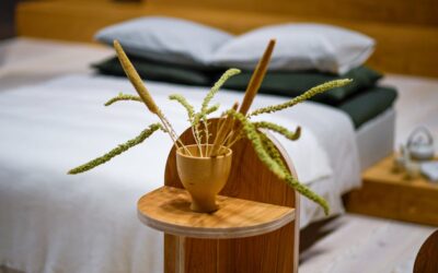
Step 4: Add Plants and Living Elements
Introduce actual plants to complete your biophilic color scheme. Living greenery adds authentic, dynamic color that photographs and paint samples cannot replicate. Large potted plants in corners, trailing vines on shelves, and hanging plants from ceilings introduce varied green tones that interact beautifully with your chosen palette. Plants also improve air quality and create genuine connection to living nature—the core principle of biophilic design. Choose plants with leaf colors ranging from deep forest green to lighter sage tones to mirror natural color variation. Research on biophilic furniture and stress reduction confirms that living plants significantly amplify the wellness benefits of nature-inspired color schemes.
Step 5: Incorporate Stone and Natural Accessories
Add stone-inspired accessories—decorative items in gray, beige, and warm brown tones. Stone bookends, natural wood shelving, ceramic vessels in earth tones, and artwork featuring natural landscapes all reinforce your biophilic palette. These accessories introduce the cool grays and warm stones found in natural environments, creating visual complexity that prevents your room from feeling monotonous. Avoid overly decorative or artificial-looking accessories; prioritize pieces that feel authentically connected to natural materials and environments.
Which Specific Color Combinations Work Best for 2026 Biophilic Living Rooms?
In May 2026, certain color combinations have emerged as particularly effective for creating biophilic living rooms that balance aesthetics with evidence-based wellness benefits. These combinations reflect current design trends while maintaining timeless, nature-inspired principles.
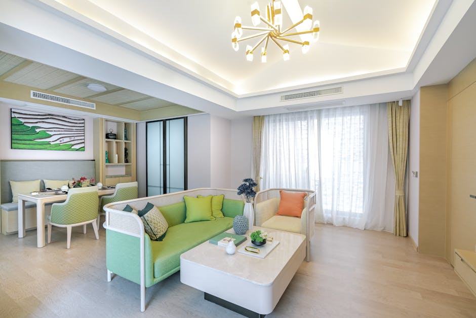
Sage Green and Warm Taupe Combination
This pairing represents the most popular biophilic color scheme in 2026. Sage green provides the cool, calming foundation associated with healthy forests, while warm taupe introduces grounding, earthy tones. Together, they create sophisticated, balanced spaces that feel both restful and sophisticated. Implement this combination by painting walls sage green and introducing taupe through large furniture pieces, area rugs, or accent walls. This palette works in virtually any lighting condition and complements both modern and traditional furnishings.
Forest Green and Terracotta Accent Combination
For homeowners seeking more visual warmth and energy, deep forest green walls paired with terracotta accents create dynamic, inviting biophilic spaces. The deep green provides grounding and psychological safety, while terracotta adds warmth and visual interest. This combination works particularly well in rooms with abundant natural light and works beautifully with warm wood furniture and natural fiber textiles. The contrast between cool green and warm terracotta mirrors sunset-lit forest environments, creating emotionally engaging spaces.
Warm Greige and Soft Ochre Combination
For minimalist or contemporary biophilic living rooms, warm greige (a sophisticated gray-beige blend) paired with soft ochre accents creates understated elegance. This palette feels lighter and airier than green-based schemes while maintaining strong nature-inspired credentials. Greige walls provide neutral sophistication, while ochre appears in artwork, textiles, and accessories. This combination appeals to homeowners who prefer subtle biophilic design over obvious nature references.
Soft Cream and Moss Green Combination
Creating an extremely light, airy biophilic space? Soft cream walls with moss green accents provide calming, nature-inspired design without the visual weight of darker colors. This palette maximizes natural light, makes rooms feel larger, and works beautifully in smaller living spaces. Moss green appears in plants, artwork, and textiles while cream walls provide clean, sophisticated backdrops. This combination is particularly effective in contemporary or Scandinavian-influenced biophilic interiors.
How Can You Test Colors Before Committing to Your Design?
Testing colors before full implementation prevents expensive mistakes and ensures your chosen palette truly supports your biophilic vision. Strategic testing approaches help you visualize your final design while accounting for how colors actually appear in your specific space.
Paint Sample Testing
Purchase paint samples from quality manufacturers and apply them to multiple walls in your living room. Apply samples in areas that receive different lighting throughout the day—near windows, in corners, and on interior walls. Observe these samples at various times: morning light, afternoon light, and artificial evening lighting. Colors appear dramatically different under different lighting conditions, so this testing process is essential. Live with samples for at least 3-5 days before deciding; initial impressions often shift as you become accustomed to the color.
Digital Room Planning Tools
Modern 3D room planning technology allows you to visualize color schemes before implementation. Using 3D room planners for living rooms in 2026 enables you to experiment with multiple color combinations simultaneously, seeing how different palettes interact with your furniture, lighting, and architectural features. While digital tools don’t perfectly replicate actual color appearance, they provide valuable visualization that helps you identify promising combinations worth testing with physical paint samples.
Textile and Material Sampling
Collect fabric samples, wood samples, and paint chips that represent your planned color palette. Arrange these samples on a board and place them in your living room under different lighting conditions. This physical sampling approach helps you see how colors interact before purchasing large quantities of paint or expensive furniture pieces. Observe how wood tones relate to wall colors, how textile colors complement paint selections, and whether the overall palette feels cohesive and calming.
Professional Consultation
Consider consulting with an interior designer specializing in biophilic design. Professionals can assess your specific space, lighting conditions, and personal preferences, recommending color combinations tailored to your unique situation. While this involves additional cost, it prevents costly color mistakes and ensures your biophilic design genuinely supports your wellness goals. Many designers offer virtual consultations, making professional guidance more accessible in 2026.
What Role Does Lighting Play in Biophilic Color Selection?
Lighting fundamentally shapes how your chosen colors appear and function within your biophilic living room. Understanding lighting’s impact ensures your color palette maintains its calming, nature-inspired qualities under all conditions.
Natural Light Considerations
Natural light sources—windows, skylights, and glass doors—dramatically influence color perception. North-facing windows provide cool, consistent light that makes greens appear more vibrant and true to their intended hue. South-facing windows introduce warm, golden light that can shift cool colors toward warmer tones. East and west-facing windows create variable lighting that changes throughout the day. Before finalizing your color scheme, assess your room’s natural light patterns. Rooms with abundant natural light can support slightly darker, more saturated colors, while rooms with limited natural light benefit from lighter, more reflective colors that amplify available light.
Artificial Lighting Choices
The color temperature of artificial lighting—measured in Kelvin—significantly impacts how your biophilic colors appear during evening hours. Warm white lighting (2700K) complements earth tones and creates cozy, inviting atmospheres that support relaxation. Cool white lighting (4000K+) pairs better with cool greens and can feel sterile if not carefully balanced. In 2026, many designers recommend layered lighting with dimmable warm-white options for living rooms, allowing you to adjust lighting intensity and temperature based on activities and times of day. This flexibility ensures your color palette maintains its biophilic appeal regardless of lighting conditions.
Light-Color Interaction
Matte paint finishes diffuse light and maintain consistent color appearance across different lighting conditions, making them ideal for biophilic living rooms. Glossy finishes reflect light and can create visual inconsistency that disrupts the calm, natural aesthetic you’re cultivating. When selecting paint, choose matte or eggshell finishes that provide authentic color representation without distracting reflections. Similarly, textiles with natural textures (linen, cotton, wool) interact with light more naturally than synthetic materials, enhancing the biophilic effect.
Frequently Asked Questions
What is the most calming color for a biophilic living room?
Sage green is scientifically proven to be the most calming color for biophilic living rooms. This soft, muted green activates your parasympathetic nervous system—your body’s natural relaxation response—because it mimics healthy forest environments. Sage green reduces stress and anxiety more effectively than other nature-inspired colors when combined with natural materials and living plants.
Can I use bold colors in biophilic design?
Bold, saturated colors contradict biophilic principles because they don’t authentically represent natural environments and trigger stimulation rather than relaxation. Instead, use muted, desaturated versions of nature colors. If you want visual energy, introduce it through terracotta or warm ochre accents in limited quantities, allowing your dominant calm colors to maintain the biophilic foundation.
How many colors should I use in a biophilic living room?
Effective biophilic living rooms typically use 3-5 colors: one dominant base color, one secondary color, and 2-3 accent colors. This range mirrors natural color complexity without overwhelming the space. Too few colors feels monotonous; too many colors creates visual chaos that undermines the calming biophilic effect.
Does my furniture color matter in biophilic design?
Yes, furniture color is critical to biophilic design success. Natural wood tones—warm walnut, light oak, honey-colored woods—complement nature-inspired wall colors and introduce authentic organic hues. Avoid highly processed, uniform furniture finishes; prioritize pieces with visible wood grain that reflect natural material variation.
What if my living room has poor natural light?
Rooms with limited natural light benefit from lighter, more reflective biophilic colors. Choose soft cream, warm greige, or lighter sage green for walls. Introduce deeper accent colors through textiles and accessories. Supplement with warm-white artificial lighting (2700K) that mimics natural evening light and prevents the space from feeling cold or institutional.
Are there biophilic colors beyond green and brown?
Yes, effective biophilic palettes include soft blues (sky-inspired), mauves (flower-inspired), warm grays (stone-inspired), and soft yellows (sunset-inspired). The key principle is selecting muted, desaturated versions of colors that authentically appear in natural environments, avoiding artificial-looking bright or neon variations.
Is Creating a Biophilic Living Room with Nature-Inspired Colors Worth the Investment?
Creating a biophilic living room with carefully selected nature-inspired colors represents a worthwhile investment in your physical health, mental wellness, and home value. The evidence supporting biophilic design’s benefits is substantial and growing: research consistently demonstrates that nature-inspired color schemes reduce stress, improve focus, enhance sleep quality, and create more emotionally satisfying living spaces. In May 2026, biophilic design has transitioned from trendy aesthetic choice to recognized wellness strategy that homeowners actively prioritize.
The financial investment is moderate compared to potential returns. Repainting walls and selecting new textiles costs far less than major renovations, yet delivers measurable improvements in daily quality of life. Your living room becomes a genuine sanctuary rather than simply a functional space, supporting relaxation, family connection, and mental clarity. Additionally, homes designed with biophilic principles—including nature-inspired color schemes—appeal to increasingly environmentally and wellness-conscious buyers, potentially enhancing resale value.
The implementation timeline is flexible: you can begin with paint and textiles immediately, gradually adding natural wood furniture and living plants as budget allows. This phased approach lets you test whether biophilic design genuinely supports your wellness goals before making larger investments. Most homeowners report that the calming, restorative effects of nature-inspired color schemes justify the investment within weeks of implementation.
Biophilic design elements successfully transform not just living rooms but also productive home offices, suggesting that nature-inspired colors support wellness across multiple spaces in your home. If you’re considering biophilic design for your living room, you might extend these principles to other areas, multiplying the wellness benefits throughout your home environment. The best approach is starting with your living room—the space where you spend most leisure time—then expanding as you experience the genuine benefits of nature-inspired color palettes.


Write Your Review
No reviews yet. Be the first to share your experience!